You want your home to feel like you (warm, friendly, and calm) right from the moment someone sees it. For a cottage-style house, the color on the outside does more than look nice.
It helps your home feel cozy, welcoming, and true to your style. This guide will help you choose the best paint colors for your cottage.
You’ll learn how to pick shades that match your home, your surroundings, and your light. You’ll also see real-life color ideas and trusted paint brands you can use.
By the end, you’ll feel more sure about what colors fit your space and make it feel just right.
What Makes a House Look Like a Cottage?
Cottage-style homes are known for their class. They often have:
- Dormer windows
- Covered porches
- Smaller footprints
- Natural materials like wood or brick
These details feel simple and relaxed. They make your home feel like a place to slow down and enjoy.
Paint plays a big part in this. The right shade makes the features stand out in a calm and welcoming way.
Top Cottage House Color Palettes
Finding the right color palette for your cottage home starts with knowing what style speaks to you. Here are some of the most loved choices.
1. Soft Neutrals
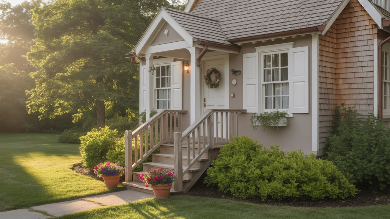
Cream, warm white, and greige (a blend of gray and beige) are classic. These colors feel clean without being too bright. They’re easy to match with trim and work well in most regions.
2. Pastels
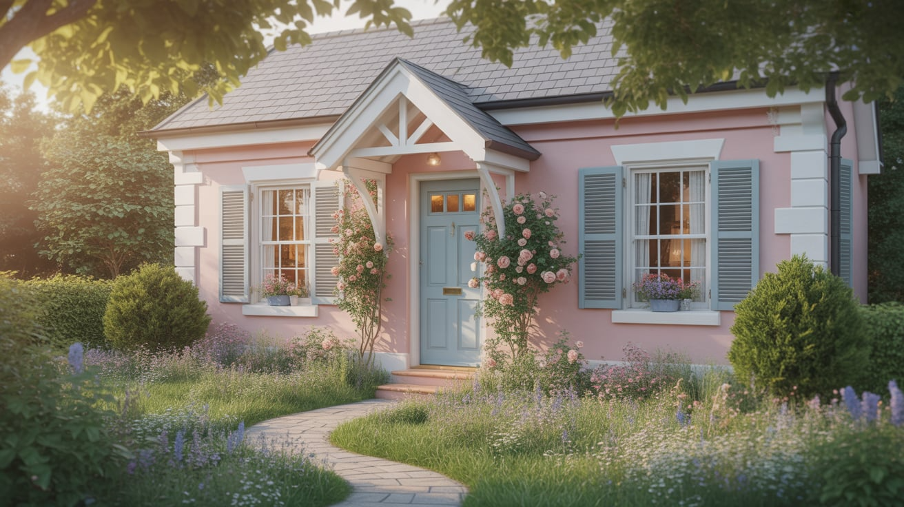
Pastels add a gentle touch. Try blush pink, pale yellow, or robin’s egg blue for a soft, happy feel. These colors look great on small homes and brighten up shaded lots.
3. Nature-Inspired Earth Tones
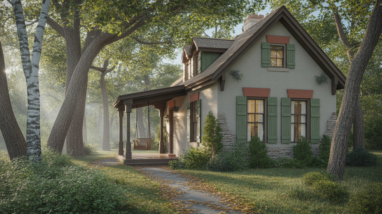
If your home is surrounded by trees or stone, earth tones can help it blend in. Moss green, clay red, and stone gray are grounded choices. They work well in woodland or rural areas.
4. Coastal Cottage Colors

Beach cottages look best with colors from the sea and shore. Think light aqua, navy, seafoam green, and driftwood gray. These colors reflect the sky and water and stay cool in the sun.
5. Classic White Cottages
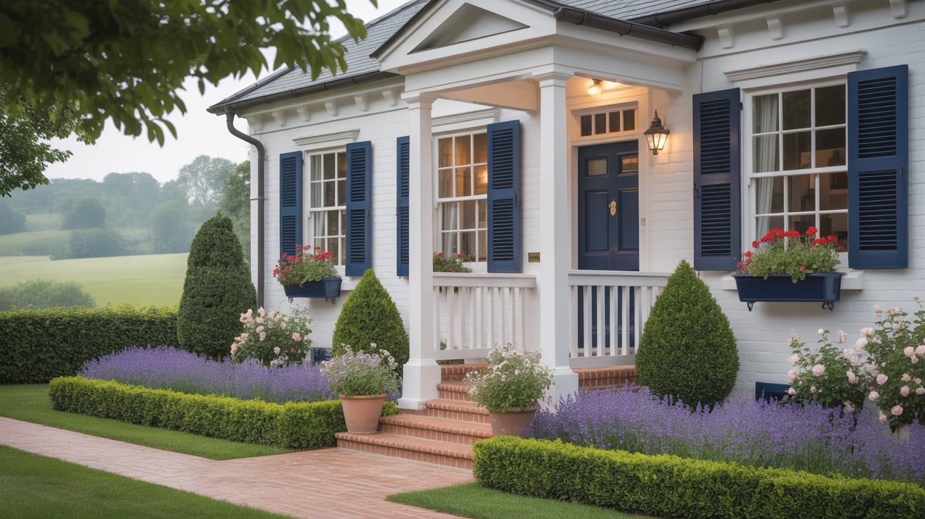
White cottages never go out of style. Pick a soft white instead of bright white for a warmer look. Accent colors for shutters, doors, and trim can include navy, black, olive green, or even blush.
Cottage House Styles
Ranging from woodland settings to coastal spaces, these styles create a sense of comfort and ease. Below are five well-loved cottage styles that highlight what makes each one feel special.
1. Vintage Cottage Style
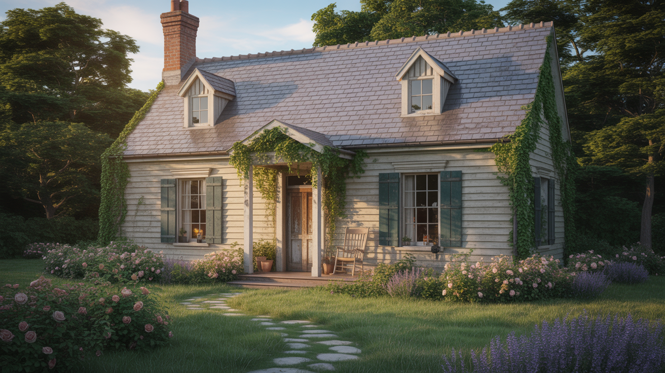
Vintage cottages often feel like stepping into the past. These homes might feature wood siding, classic shutters, and aged brick chimneys. The beauty comes from time-worn details and thoughtful design that feels personal and lived-in.
Soft paint colors like cream, dusty blue, or faded yellow work well here. These shades help bring out the home’s original character while giving it a gentle update.
2. Coastal Cottage Style
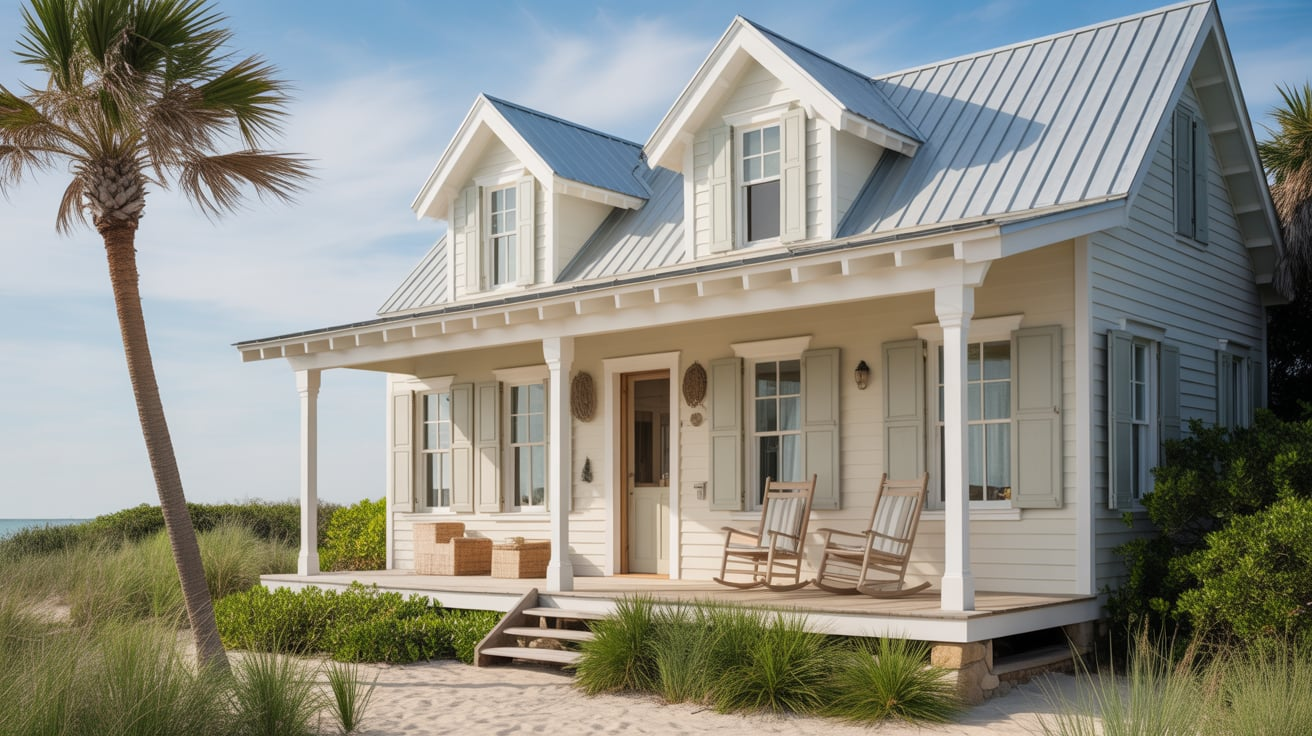
Coastal cottages are light, open, and easygoing. They usually sit near water or borrow colors from the shore. You’ll see light blues, soft grays, and creamy whites, often paired with natural wood or weathered stone.
These homes may have wide porches, airy layouts, and large windows that let in plenty of sunlight. A coastal color scheme helps make the space feel cooler and more relaxed, perfect for warm climates or breezy afternoons.
3. Woodland Cottage Style
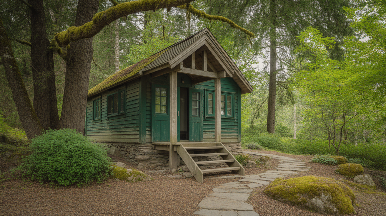
Woodland cottages are built to feel close to nature. They’re often found near forests or tucked into quiet mountain areas. These homes use colors that come from the land around them (deep greens, warm browns, and soft grays).
They might have stone bases, timber frames, and cozy porches with shaded views. Choosing earthy paint tones helps the home blend into the trees, making it feel peaceful and quiet, like it belongs in the woods.
4. English Countryside Cottage
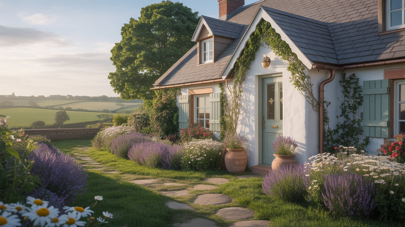
This cottage style brings to mind flower beds, stone paths, and rolling fields. English countryside homes often feature whitewashed walls, curved rooflines, and climbing vines.
Popular colors include muted greens, clay, pale yellow, and faded blue. These shades pair well with garden views and help make the home feel rooted in its setting.
The style works best with natural finishes and soft, low-contrast color combinations.
5. Modern Cottage Style
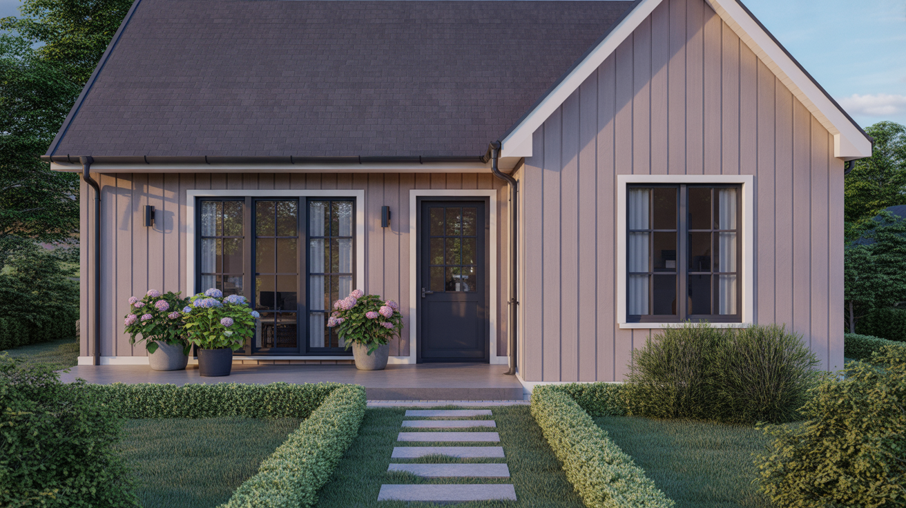
Modern cottage homes mix the cozy look of old cottages with clean and simple design. They often keep basic shapes and welcoming porches but add smooth siding, big windows, and updated trim.
Instead of bright or bold shades, modern cottages use calm colors, like soft black, off-white, warm gray, or dusty taupe. This mix of old and new makes the house feel clean without losing its warmth.
It’s a great option if you want a simple home that still feels friendly.
Best Paint Brands and Palettes for Cottage Colors
Once you’ve got a sense of the colors you like, it helps to know where to find them. Many well-known paint brands offer ready-made palettes designed with cottage homes in mind.
These can save you time and help you feel more sure about how colors will work together. Here are a few trusted options to consider:
1. Sherwin-Williams Options
Sherwin-Williams has themed sets that make picking a palette easier, especially if you’re going for a certain look. Their Coastal, Cottagecore, and Farmhouse paint collections include colors that work well together without much guesswork.
These sets often feature soft blues, muted greens, and warm whites that fit cottage homes perfectly.
2. Benjamin Moore Picks
Benjamin Moore is known for classic and soft shades, many of which have been used on cottage-style homes for years. Their historic collection includes subtle creams, earthy tones, and gentle pastels that fit well with both older and newer cottages. Their paints also hold up well over time and offer smooth coverage.
3. Etsy Curated Palettes
Etsy sellers offer downloadable paint guides for cottage homes, often based on specific themes like French country, vintage, or coastal. These guides may include hex codes, paint names, and pairing tips.
It’s a simple way to try a designer-inspired palette without hiring help.
4. Affordable Paint Alternatives
If you’re working with a smaller budget, Behr and Valspar are both strong choices. They offer many soft and nature-inspired tones, and their paints are widely available in home improvement stores. Most locations can also match colors from higher-end brands if you bring in a swatch or name. You can check out Behr colors and Valspar options.
Color Pairings That Work Beautifully
Pairing colors is where things really come together. Here are a few ideas that look great on cottages:
- Pale sage siding with white trim and a brick walkway
- Sky blue exterior with a soft yellow door and light gray shutters
- Dusty rose siding with charcoal gray shutters and off-white trim
These combos bring out your home’s beauty without feeling too busy. Keep it simple and easy to maintain.
How to Choose the Right Color for Your Cottage
Picking a paint color requires considering your home’s details, surroundings, and even the way light hits your walls.
- Match your home’s style and age: Older homes often look better with soft, classic tones that feel grounded. Newer homes may suit bolder contrasts or cleaner, more modern finishes.
- Think about your region and sunlight: Bright sunlight can fade lighter shades. On the other hand, shaded homes might need warmer or slightly deeper tones to keep from looking dull.
- Look at your roof, trim, and landscape: Your roof color, porch steps, stone paths, and even nearby plants all play a role. Pick paint that fits with what’s already around your home.
- Always sample before painting: Paint a few test areas on different sides of your home. Look at them in the morning, afternoon, and late in the day. The same color can shift a lot depending on the light.
These small things can make a big difference in the final color.
Final Tips for a Flawless Cottage Paint Job
Before you start painting, a few small steps can make a big difference in how your home turns out.
- Prep your surface well (clean, scrape, sand, and prime)
- Decide if you want to DIY or hire a pro based on the size and height of the home
- Use the right finish: flat or eggshell is good for siding; gloss or semi-gloss for trim
- Touch up often: lighter colors may need more care, but are easier to repaint
Taking the time to plan, prep, and choose the right finish will help the color last longer and look better in every season.
Wrapping Up
Now, you have a bunch of ideas, like soft tans, creamy whites, and beachy blues. You’ve also learned what really matters before you start painting. Things like:
- How sunlight hits your house
- What materials your home is made of
- The shape and size of your home
Still unsure? That’s totally okay. Here’s what you can do:
- Try a few small test spots on the wall.
- Look at them during different times of day.
- Wait a day or two before making a choice.
Want more help? We’ve got other easy guides. These can help you keep going until your home looks and feels just how you like it.

