

Introduction to Bootstrap 5 Cards
Picture this: You’re building a website, and you need a way to organize and display your content visually appealingly. Enter Bootstrap 5 Cards! These sleek and adaptable components offer a clean and easy way to create informative and visually appealing sections on your web pages. These cards provide a basic structure that allows you to include headers, content, images, and even footers. You can add text, links, buttons, and anything else within the card’s body. Bootstrap also provides customization options so you can adjust the look and feel of your cards. It includes background colors, text styles, and how the cards respond to different screen sizes.
Think of Bootstrap 5 Cards as the building blocks of your website’s layout. They come in all shapes and sizes, from simple rectangles to complex grids, and can be easily customized with CSS to match your brand’s unique aesthetic. And the cherry on top? They’re fully responsive, ensuring they look splendid on any device, whether a sprawling desktop screen or a pocket-sized smartphone. Bootstrap 5 Cards can save you a ton of time and effort, allowing you to focus on the fun stuff like designing and coding.
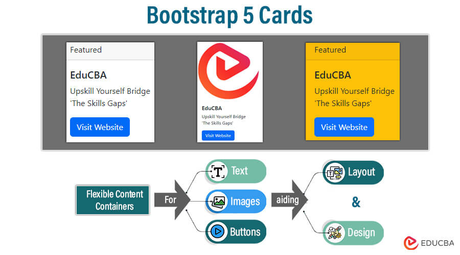
Table of Contents
Key Takeaways
- Cards are an adaptable and expandable media container.
- It can hold a variety of content, including images, text, list groups, and links
- You can use the basic card class to create a card
- You can use the card-body class to add content to a card
- Since cards have no top, left, and right margins by default. So, use spacing utilities as needed.
- Bootstrap is designed to be responsive. It can adjust its layout to fit the size of the screen.
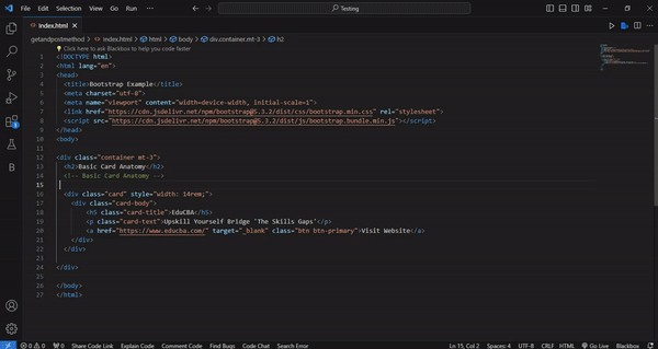
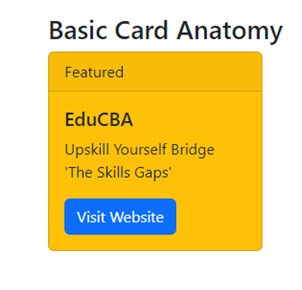
Basic Card Anatomy
1. The .card Class
The .card class is the basic container for the card component. It provides the structure and basic styling for the card. It serves as the outermost wrapper for the card content. For example,
In this code, there is a div with class=” card.” Now, you can access other classes with this card.
2. The .card-body Class
The .card-body class operates within the .card element, defining the main content area of the card. It applies padding and default styling to the content. For instance,
This code has a parent class with class=”card.” Within this, the class=”card-body” is used.
3. Optional Elements (.card-title, .card-text, .card-link, .card-footer)
Some optional elements include .card-title, .card-text, .card-link, .card-footer, etc. You can include these within the card body. These elements provide more functionality and appearance.
- .card-title: It shows the title of the card.
- .card-text: It has the main textual content of the card.
- .card-link: It renders hyperlinks within the card.
- .card-footer: It provides content and actions related to the card content. It shows at the bottom of the card.
For example:
Card Title
A brief sample text that serves as the main body of the card's content and builds upon the card title
Card Link


Updated 10 minutes ago
In this code, there is first a ‘card’ class division and then a ‘card-body’ division. We have defined the ‘card-title’ class, which describes the card’s title. The ‘card-text’ class describes the card’s text, and the ‘card-link’ class describes the card’s link. We also have the ‘footer’ class within this ‘card’ class.
For Example:
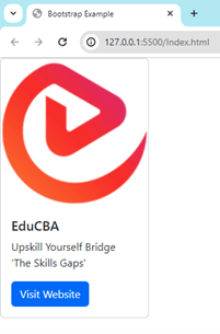
Consider this code for all card examples used in this blog. You can modify the card class’s code whenever needed.
Bootstrap Example
[email protected]/dist/css/bootstrap.min.css" rel="stylesheet">
Output:
Explanation:
We have included the page title, a CSS link to Bootstrap, and other information in this code.
In the HTML body section, we created a container for card examples. Within this container, we have used card elements with fixed widths. Inside the card class, we have structured the card body, which includes the card title, text, and link. Now, you can put this code into VS Code and run the server.
Note that if you do not set style=”width: 14rem;” in the card class, this card will be responsive to the page. Similarly, you can also set the height of the card.
Image Integration
There are various options for images on cards. You can choose any of them. You can add a photo at either end of the image so the content overlaps with it.
1. Image Placement
Like the header and footer, you can also place images at the top and bottom of the card.
For example, the image is at the top of the card:
Output:
The image is at the bottom of the card:
Output:
Note that using various styles, you can also place this image on the left and right of the content.
2. Tips
These are important tips while adding images to the card.
- You can select images that complement the content and style of your cards. Use high-quality images with suitable resolution.
- You should use image optimization techniques like lazy loading, image compression, etc.
- You should be careful while using an overlay image. Use proper background color and text color. You can also use transparent overlays and subtle gradients to improve readability.
- You should use only a few images on the same card.
- You can also center the image, resize the image, etc., inside the card.
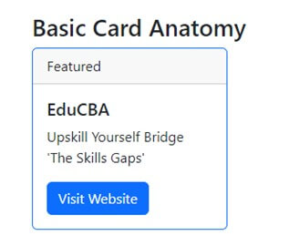
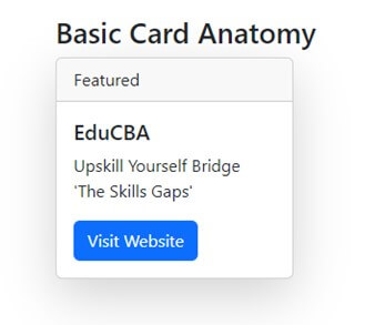
Card Headers and Footers
Like the card images, you can add a header and footer. These headers and footers provide more context and action related to the card content.
For example, consider this code.
Featured
Output
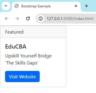
In this code, we have added a section that is the card’s header just above the body. You can customize the header content by adding desired HTML elements within the .card-header div.
Similarly, you can also add a footer to the card:
Last updated 3 mins ago
Output
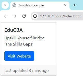
In this code, we have added a .card-footer class to show the text “Last updated 3 mins ago”. You can also customize the footer content to match the header.
Card Layouts
Bootstrap 5 allows you to set card layouts in various ways. It organizes and presents content effectively. These layouts include card groups, card columns, card decks, etc. We have discussed some of these as follows.
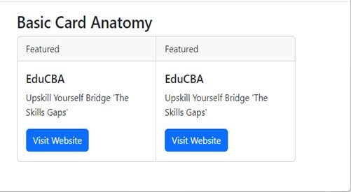
1. Card Groups
Combining multiple cards allows for various presentations. Within a group, cards should display with equal width and height. Card groups are useful for presenting related content and organizing multiple pieces of information in a structured manner.
You can group cards like this :
You can have multiple cards under the .card-group container, as shown above. These groups will appear together as a cohesive unit.
You can run the example below using previous card examples.
Note that you can modify the content of each card separately.
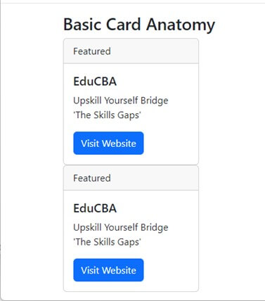
2. Card Columns
You can arrange cards in a multi-column layout. This layout displays cards side by side in a grid-like structure. This layout presents many cards while maintaining a clear and organized display.
You can list cards in a column like this:
You can have multiple cards under the .card-columns container, as given above. It will arrange them into multiple columns based on the available space.
You can run the example below using previous card examples.
3. Card Decks
Card decks are similar to card groups. However, card decks provide more flexibility for spacing and layout. Cards within a deck maintain their widths. So you can have variations in content presentation. This layout shows a collection of cards with different content lengths or styles.
For example, you can have a card deck like this:
It is similar to the grouping card given above. The only difference is the flexibility in displaying content.
Note that the output of the card deck will be in a column like the card columns class.
Customization
There are various options for customizing the appearance of cards. For example, background colors, borders, sizing, shadows, etc. We have discussed some of them.
1. Background Colors
You can choose from predefined color classes for your card. These colors are, .bg-primary, .bg-secondary, .bg-success, .bg-info, .bg-warning, .bg-danger, etc.
For example:
In this example, the card background color is set to warning using the bg-warning class.
2. Borders
You can also customize the borders of cards using Bootstrap 5 utility classes. You can add/remove borders as needed. These classes are .border, .border-0, .border-top, .border-bottom, .border-start, .border-end, .rounded, etc.
For example:
<div class="card border-primary">

div>
We have set the border color using the border-primary class in this card.
3. Sizing
You can also control the size of cards using predefined sizing classes. You can use classes like, .w-25, .w-50, .w-75, .w-100 for width, and .h-25, .h-50, .h-75, .h-100 for height.
For example:
<div class="card w-50">

div>
The width of the card is set to 50% using the .w-50 class.
4. Shadows
You can set the depth and dimension of cards using shadow utility classes, like .shadow-sm, .shadow, .shadow-lg, .shadow-none, etc.
For example:
<div class="card shadow-lg">

div>
We set the large shadow using the .shadow-lg class.
Advanced Examples
Bootstrap 5 has advanced features and components for creating sophisticated card layouts and designs. We have discussed some of them here.
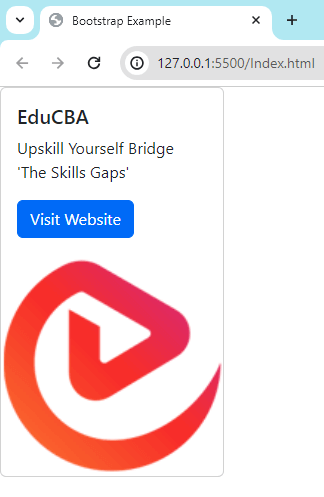
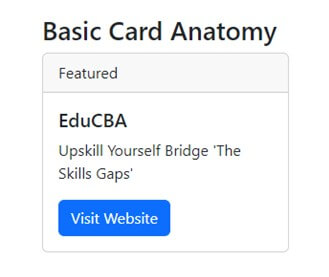
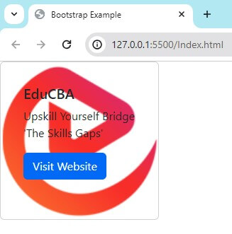
1. Image Overlays
You can display this image as the background of the text overlay on the card. You can position content over the image within the card.
For example:
<div class="card" style="width: 14rem;">
<img src="https://cdn.educba.com/academy/wp-content/uploads/2020/07/educba_logo_150x150.png" class="card-img" alt="...">
<div class="card-img-overlay">
<div class="card-body">
<h5 class="card-title">EduCBAh5>
<p class="card-text">Upskill Yourself Bridge 'The Skills Gaps'p>
<a href="https://www.educba.com/" target="_blank" class="btn btn-primary">Visit Websitea>
div>
div>
div>
We have added class card-img-overlay below the image class. We moved the
Output
2. Complex Card Structures
You can also create complex card structures using various components and layouts. You can use grids and columns for multi-column layouts. You can also have elements like headers, footers, and lists. You can place cards nesting within each other.
For Example:
Complex Card Structure
[email protected]/dist/css/bootstrap.min.css" rel="stylesheet">
Complex Card Structure

Main Card Title
This is a longer card with supporting text below as a natural lead-in to additional content.
Nested Card 1
Some quick example text to build on the card title and make up the bulk of the card's content.
Nested Card 2
Some quick example text to build on the card title and make up the bulk of the card's content.
- List item 1
- List item 2
- List item 3
Output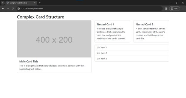
Best Practices and Common Use Cases
1. Best Practices
These are best practices while using card classes in Bootstrap 5:
- You should keep the card simple. Make sure the content of the card is clear.
- You should be careful with responsive design. Do not fix the sizes, like height and width.
- You should use the same type of card on your website. You should always use the same colors, fonts, and space to create all cards. It will maintain consistency.
- You should use various image optimization techniques, such as lazy loading, and optimize the size of the image used.
- You should always use card groups and create a grid of cards. The content will automatically line up. We can create cards using the row-cols and col classes.
- You should make cards horizontal. It will have a mobile-friendly and responsive design.
- You should always make the cards the same height.
2. Common Use Cases
These are various uses of cards:
1. Product Listing
You can use cards to display product information such as images, descriptions, prices, ratings, etc.
2. Blog Post Preview
You can include an image title and a synopsis of the blog entries. Readers can click the provided link to read the entire blog post.
3. Portfolio Showcase
You can show portfolio items like projects, artworks, case studies, etc., and link to view more details.
4. Testimonials
You can display reviews and testimonials on the cards, along with a profile picture, name, position, and review/testimonial content.
5. Even Listing
You can show upcoming events, conferences, and workshops on the cards. You can include event details like date, time, location, and brief description. Users can register by clicking the link on the cards.
Conclusion
Bootstrap 5 cards are flexible content containers. Various options are available to display and design Bootstrap 5 cards. Flexbox construction allows cards to align easily and mix well with other Bootstrap components. They have no margin by default, so you can use spacing utilities as needed. Cards can support various content, including Images, Text, List groups, Links, and Buttons. Bootstrap 5 cards display content listings, such as products, reviews, events, etc.
Frequently Asked Questions (FAQs)
Q1: Can you add custom animations or transitions to Bootstrap 5 cards?
Answer: Bootstrap 5 cards do not provide built-in support for custom animations. However, you can use this functionality using CSS animations and third-party animation libraries like Animate.css.
Q2: Can you create collapsible and expandable cards in Bootstrap 5?
Answer: Bootstrap 5 does not have built-in functionality for collapsible and expandable cards. However, you can use JavaScript frameworks like jQuery and custom JavaScript code to achieve this behavior.
Q3: Can you create cards with dynamic content using Bootstrap 5?
Answer: Yes. You can dynamically render content using server-side and client-side scripting languages like PHP and JavaScript and frameworks like React and Angular.
Q4: Can you nest cards within each other in Bootstrap 5?
Answer: Yes. You can nest Bootstrap 5 cards within each other to create complex card structures and layouts.
Recommended Articles
We hope that this EDUCBA information on “Bootstrap 5 Cards” was beneficial to you. You can view EDUCBA’s recommended articles for more information,